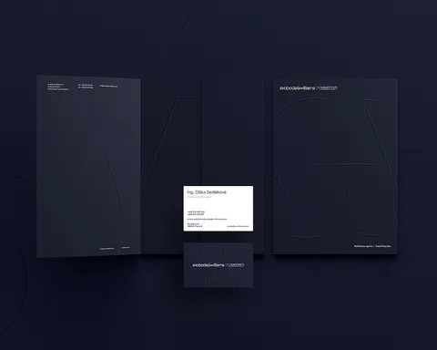
After 18 years in business, Svoboda & Williams, one of the strongest brands in the real estate market, is refreshing its visual style.
“For over a decade, we have been building a brand associated with utmost luxury, and so the visual quality of our communication strategy is absolutely crucial. We’re acutely aware of the importance of a strong logo and streamlined visual style that reflect contemporary trends. Recently, our forward-facing communication has moved into the digital realm, so we wanted this latest rebranding to go with the times, while respecting established tradition,” says Natálie Bartošová, head of Svoboda & Williams’ marketing team.
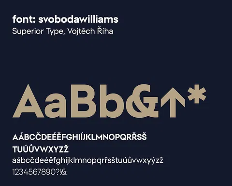
The logo and original font was created for Svoboda & Williams by typographer Vojtěch Říha from the Superior Type studio, and the brand manual was authored by Bicepsdigital. Premium brands often use a bespoke font. “We tried to adhere to the somewhat contradictory requirements of trendiness and timelessness, and come up with a font that would express the company’s values,” explains Říha, adding that the geometrically constructed letters have sharp points that are softened by a decorative ampersand.
“I believe that the rebranding beautifully reflects the concept of understated luxury, which is the basis of our visual communication in the high-end segment. At the same time, clients can more comfortably navigate our website,” concludes Bartošová.

